|
Latest News News Archives Interviews Mapping Contest |
||
| Maps | ||
| Download | ||
| Map Paks | ||
| Map Resources | ||
| Skies | ||
| Textures | ||
| Sounds | ||
| Prefabs | ||
| Tutorials | ||
| Editors | ||
| Links | ||
| .txt Gen | ||
| MapRid | ||
| Submit Map | ||
| Requirements | ||
| Testing How-To | ||
| Upload Map | ||
| FAQ | ||
| Forum | ||
| Top Maps (CLQ) | ||
| Death Match | ||
| Team Play | ||
| Search | ||
| Mailing List | ||
| AQMD Staff | ||
| Suggestions | ||
|
Balancing R_Speeds and Style by Mexican Radio |
|
Okay, so by now everyone knows about the little trick of keeping your poly count down by pulling certain brushes away from other brushes by 1 unit (if you don't know how to do this, there are some excellent tutorials on RUST). Initially, you might think (as I did) that this technique is a cure-all for decreasing r_speeds in your map, but there are definately times when you don't want to use it. So instead of focusing on the 'how' in this tutorial, I'm going to focus on the 'when', as in 'when should I use this techique?'
Let's look at the down side. First off, even though the gap is only one unit thick, if it's at eye level you can be pretty sure that players will see it during a match. And it's important to remember that eye level can change... by crouching, jumping, walking up or down ramps and stairs (be especially wary of this), etc. You may be able to use this in dark areas, but be aware that any bit of light on the other side of the gap will filter through at eye level (even if the gap is only 1 unit thick).
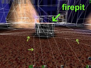
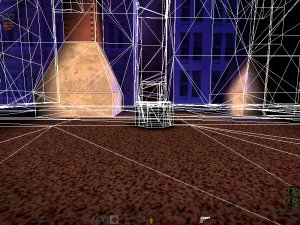
The next problem involves lighting. One of the maps that I am currently building for Terror Quake (FATHER PANIC) has a large outdoor area, complete with a few buildings, a firepit, and a large overpass. In order to keep r_speeds to a minimum, I had to do some creative work with this technique.
One of the areas that I was able to finesse was the firepit just under the overpass. Take a look at Fig. 3; you can see by the arrows the amount of polygons this firepit adds to the area. Now look at Fig. 4, after I raised the pit 1 unit from the ground. The polygon count is significantly less.
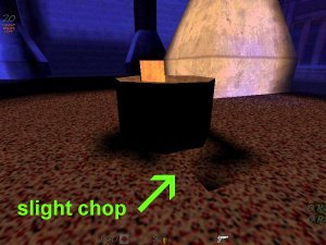
Unfortunately, this is where our downside is. Looking at Fig. 5, you can see how light can get chopped up by using this trick. Sometimes the shadows make the object in question appear to be floating in the air. For this map, I'll ultimately fix the problem by adding more light around the pit to get rid of ALL shadows.
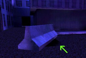
One more instance of choppy lighting... the highway divider in Fig. 6 is one unit off the ground, giving it an odd shadow cast. The problem here is that I can't really add light to get rid of the shadows, because there really IS no light. I may have to end up experimenting with low levels of blue lighting... on the other hand, is it really going to be noticable by players? You'll have to decide this in your own maps on a case by case basis.
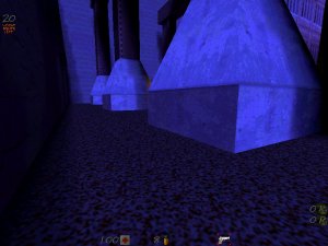
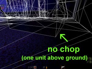
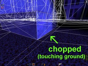
Next came the concrete pilings. I didn't want any chop around them; I wanted them to look solid and unmoveable (Fig. 7). However, some of the pilings were in dark areas, and so I took advantage of this by raising them one unit from the ground. Again, you can see the difference in polygon counts by comparing the two (Fig. 8 and 9). And as a result of all of this, the r_speeds (in this rather large and crowded area) never get much above 500.
As you can see, there's definately an art to using this technique. Try it out yourself; the only way you'll become proficient is to experiment to find what works for you. Hope this helps.
|

| Newest Resources | ||
| New sky by GreyDeath | ||